
TL;DR
Expanded color gamut printing uses a print condition with a color range beyond conventional CMYK. A common seven-color implementation adds orange, green, and violet, often abbreviated as CMYKOGV. Those extra inks can improve the reproduction of some vivid brand colors, illustrations, and packaging graphics, but they do not make every color printable or eliminate the need for proofing. Ask the provider for its accepted color space, output profile, separation method, PDF settings, substrate details, and proof options before converting or exporting your artwork.
What expanded color gamut printing means
A color gamut is the range of colors a device or print condition can reproduce. Conventional process printing builds colors with cyan, magenta, yellow, and black. Expanded color gamut printing, also called extended gamut or multicolor process printing, extends that range with additional process inks. Orange, green, and violet are a typical combination because they help reproduce colors that CMYK alone handles poorly. PRINTING United Alliance’s ECG overview describes this seven-color approach and its development as a more predictable production condition.
The extra inks do not simply make an image “more colorful.” Their value depends on the artwork. A muted watercolor may change very little, while a poster with intense oranges, greens, and violets may gain a closer match to the intended palette. Deep blues, saturated digital artwork, and some brand colors may also benefit, depending on the specific press, inks, substrate, and separation process.
ECG should also be distinguished from XCMYK. PRINTING United Alliance lists ECG and XCMYK Expanded Gamut as separate specifications: ECG concerns multicolor printing, while XCMYK is an extended-gamut CMYK method. The Alliance specifications library provides the relevant datasets, profiles, test charts, and production resources.
Why the screen preview is not enough
Your display creates color with emitted RGB light, while a printed sheet reflects light from inks and its surface. Even an expanded ink set cannot reproduce every RGB color. When artwork is transformed into a destination print space, out-of-gamut colors are remapped, which can change saturation, detail, or visual separation between nearby colors. Adobe’s out-of-gamut guidance explains how proof profiles and gamut warnings can reveal colors that fall outside an intended output condition.
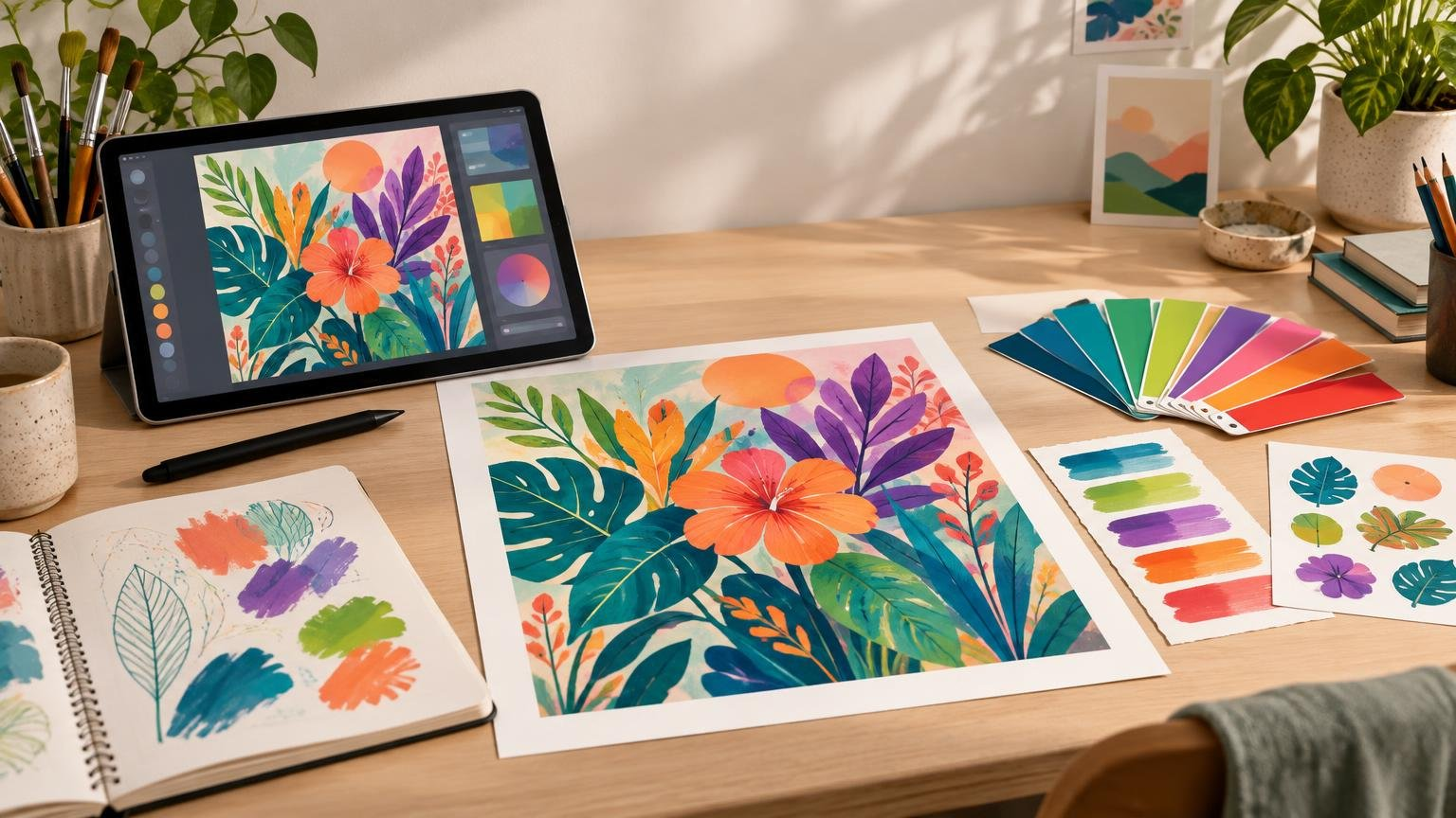
This matters most when color carries the design. Imagine a Procreate illustration built around a luminous green focal point. Standard CMYK may dull that green; an ECG condition might reproduce it more closely, but only if the provider’s gamut includes it. The practical question is not whether ECG is “better” in the abstract. It is whether the selected print condition reproduces the colors that matter in your artwork.
Use the provider’s color condition, not a generic recipe
An ICC profile describes the relationship between device values and a standardized color space. In a managed workflow, color can be transformed from the artwork’s working space into the printer’s output space using a suitable profile. The International Color Consortium’s profile guidance explains this role of profiles in color transformations. For a practical introduction, see TutorArt’s guide to ICC profiles for printing.
Before changing the document mode or converting colors, ask the provider:
- Which ECG ink set and print condition will be used?
- Should artwork remain in RGB, use CMYK, or be supplied in another accepted space?
- Will the provider perform the ECG separation, or must the designer supply separated content?
- Which ICC or proof profile should be used for soft proofing?
- How should named spot colors, brand colors, and overprints be prepared?
- Which PDF standard and color-conversion policy does the workflow require?
- What substrate and finish will be used, and are contract or production proofs available?
If the provider performs the final separation, manually creating orange, green, and violet channels may interfere with its workflow. Preserve editable source files and follow the supplied specification instead of guessing. If you are still exploring custom print products and broader production topics, Printiverse is a useful next stop, but ECG requirements must be confirmed with the provider handling the actual job.
A creator-focused ECG workflow
1. Identify the colors that matter
Mark the artwork’s critical colors before conversion. These may include a logo, a saturated illustration accent, a product color, or a set of colors that must remain visually distinct. Not every pixel deserves equal attention. Defining priorities helps you judge a proof intelligently instead of asking whether the whole sheet vaguely looks “more vivid.”
2. Keep a wide-gamut, editable master
Retain the original RGB artwork, vector objects, live text, named colors, and editable effects where practical. Create production files from that master rather than overwriting it with an early conversion. Vector artwork remains scalable, but its color values still need interpretation within the output condition; vector format does not make a color automatically printable.
3. Soft proof with the correct profile
Use the provider’s profile as the proof condition and inspect the image on a reasonably calibrated display. Turn the proof preview on and off while watching critical saturated areas, dark detail, neutral grays, and smooth gradients. A gamut warning can identify colors outside the simulated condition, but it does not decide whether the mapped result is visually acceptable.
Soft proofing predicts a defined output condition; it does not guarantee the final sheet. Paper color, texture, gloss, ink behavior, viewing light, and finishing can all change the appearance. An uncoated surface, for example, may make contrast and saturation feel softer than the same artwork on a glossy stock.
4. Adjust selectively
If a critical color shifts, avoid applying a global saturation boost immediately. That can damage skin tones, neutrals, shadows, and colors that were already printable. Instead, adjust the important hue or tonal region while viewing the proof simulation. Save the adjustment as an output-specific version so the master remains available for other print conditions.
5. Export according to the production plan
PDF export may preserve existing numbers, convert content to a destination, or leave conversion to a later stage. These choices are materially different, so there is no safe universal selection. Adobe likewise advises consulting printer documentation and avoiding double color management when the application controls conversion. TutorArt’s PDF versus PNG printing guide explains why a complete layout usually calls for a production PDF rather than a flattened image file.
6. Approve a relevant proof
Ask what the proof represents. A calibrated contract proof may target the intended condition, while a desktop print or ordinary PDF preview may only provide a rough visual check. Hard-proof accuracy depends on the profiles, display calibration, proofing system, and how closely that system simulates the final output. Evaluate the proof under suitable lighting and compare the critical colors, neutral balance, shadow detail, gradients, small text, overprints, and transparency effects.
ECG, spot colors, and standard CMYK
| Approach | Best fit | Creator’s main concern |
|---|---|---|
| Standard CMYK | Artwork whose important colors fit the chosen CMYK condition | Use the correct profile and proof the conversion |
| Expanded color gamut | Designs with several saturated colors that may benefit from a wider process gamut | Follow the provider’s separation and proofing workflow |
| Spot colors | A small number of specifically controlled colors or special inks | Preserve correct named colors and confirm how they will be printed |
ECG can reproduce a wider range from a fixed process ink set, which may reduce reliance on individual spot inks in some production environments. It does not guarantee an exact match to every spot color. If a color is contractually or visually critical, ask how the provider measures and approves it. TutorArt’s Delta E color-difference guide can help you discuss measured tolerances without assuming one number suits every project.
The practical takeaway
Treat expanded color gamut printing as a defined color-management workflow, not an export effect. Keep an editable master, identify critical colors, obtain the actual output profile and production instructions, soft proof for that condition, and approve an appropriate physical proof when color matters. The extra inks create useful possibilities, but the provider’s characterization, conversion, substrate, and proof remain the bridge between vivid on-screen artwork and a predictable printed result.
References
- New Alliance Extended Color Gamut (ECG) Dataset Now Available: Revolutionizing the Printing Industry
- Specifications for Print Production | PRINTING United Alliance
- Identify and correct out-of-gamut colors in Photoshop on desktop | Photoshop
- ICC Frequently asked questions — International Color Consortium
- Print with color management in Illustrator | Illustrator
- PDF marks, bleeds, and color output settings
- Print hard proofs in Photoshop