
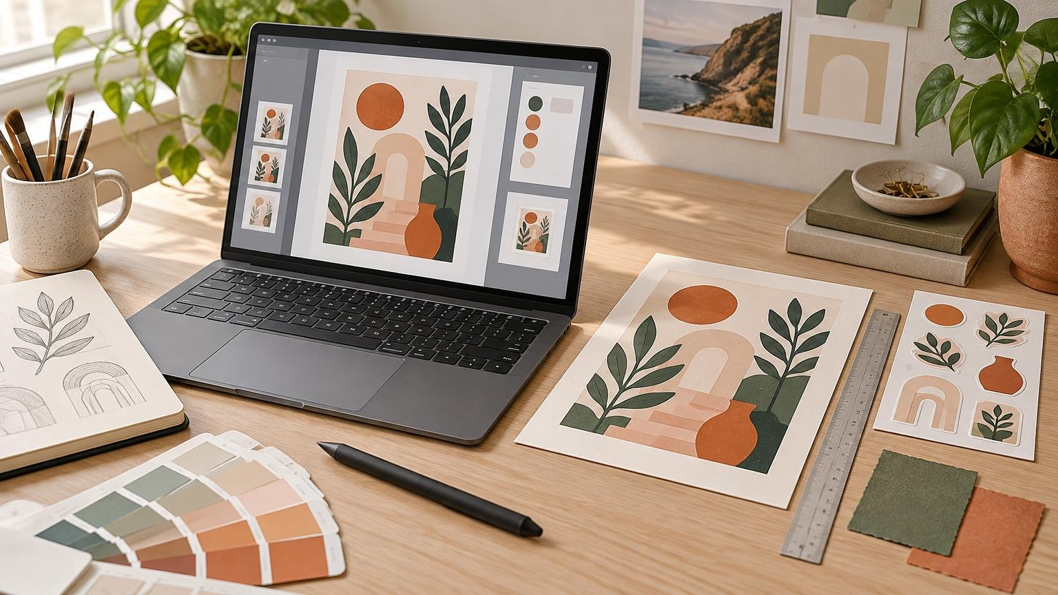
TLDR: Accurate product mockups for artists preserve the real item’s dimensions, proportions, construction, material, finish, and included components. Start with confirmed production details, fit the artwork to the object’s geometry, and use highlights and shadows that suit the material. If the product has not been manufactured or photographed, label the image as an illustrative mockup and avoid promising exact color.
A mockup can look beautifully lit and completely believable while still giving customers the wrong idea. The goal is not simply realism. It is representativeness: someone looking at the image should form a reasonably accurate expectation of what is being offered. That standard applies whether you are presenting an art print, sticker, card, package, digital download, or client concept.
What makes accurate product mockups for artists?
An accurate mockup communicates the product’s important physical characteristics without exaggeration. It does not make a small sticker appear laptop-sized, turn ordinary paper into a mirror-like surface, add thickness that is not present, or show a frame without explaining that the frame is excluded.
This is different from making every image clinically neutral. Styling, attractive lighting, props, and lifestyle scenes are useful. Problems begin when those choices alter the apparent product rather than provide context for it.
The U.S. Federal Trade Commission says advertising should be truthful, non-deceptive, and supported by evidence. Its guidance also considers the overall impression of an advertisement, not merely one isolated statement. That makes the combination of image, caption, dimensions, and product description important. A small disclaimer may not correct a mockup whose central visual message is materially inaccurate. Creators selling in the United States can review the FTC’s advertising and marketing guidance.
Build the mockup from confirmed product details
Do not choose a generic template first and then force the product into it. Begin by collecting the characteristics that a customer would notice when the item arrives. Confirm them with the printer or manufacturer when production is outsourced.
- Finished dimensions and orientation
- Shape, including rounded corners or a custom cut line
- Whether the product is flat, folded, bound, mounted, framed, or packaged
- Material or substrate
- Surface finish, such as matte, gloss, metallic, textured, or transparent
- Approximate edge appearance and construction
- Which accessories, packaging, props, or frames are included
- Whether the visual represents a manufactured item, production proof, prototype, or concept
A print-ready file and a sales mockup have different jobs. The production file tells the printer how to manufacture the item; the mockup tells the customer what to expect. Before creating the sales image, make sure the underlying artwork follows applicable requirements for bleed, margins, resolution, and file type. The print design basics guide explains how those production details affect finished work.
Match scale and proportions before adding style
Enter the real aspect ratio rather than resizing the artwork by eye. If a landscape print has one proportion but the template opening has another, filling the opening may crop the composition or stretch it. Both changes can misrepresent the product.
Scale also needs context. A close crop can make a small sticker look enormous, while a distant room scene can make a substantial print look tiny. Use at least one image that provides an understandable reference, such as a hand, notebook, desk, wall, or mailing package. Props should be plausibly sized and should not cover the product’s defining features.
Lifestyle scenes are not precise measuring tools, so pair them with a clean image or dimensions graphic. State the finished dimensions in the listing instead of expecting customers to estimate them from furniture. When multiple sizes are offered, either make separate representative mockups or clearly identify which size appears in each scene.
Raster artwork also needs sufficient pixel dimensions for the final product size. Enlarging a small illustration inside a mockup can hide softness that will become visible in print. Vector artwork scales differently, but embedded raster textures and effects may still have resolution limits. See raster versus vector for print design for a practical explanation.
Fit the artwork to the product’s real geometry
Perspective errors are among the fastest ways to make a mockup feel pasted together. The artwork’s edges and internal features should recede in the same direction as the product. A card lying on a table, for example, should not contain artwork that still looks perfectly front-facing.
Treat different surfaces as different planes. The front, spine, side, flap, and top of a package cannot share one flat transformation. Adobe’s Vanishing Point documentation notes that perspective planes must align with the geometry visible in the image; a technically valid plane is not automatically the correct one for the photographed object.
Curved products need more than a four-corner perspective transform. Artwork wrapped around a cup, bottle, fabric pouch, or cylindrical package should compress as it turns away from the viewer. Straight lines may curve with the surface, and details near the edge should not remain as wide as details facing the camera.
Keep a reusable artwork layer separate from lighting, texture, and background elements. In Photoshop, Smart Objects support non-destructive scaling, perspective changes, distortion, and warping without directly changing the source content. This makes it easier to revise the artwork while preserving the mockup structure. Exact controls vary by application, but the same principle applies: preserve an editable source and transform a placed instance.
Show edge thickness and construction honestly
Edges tell customers what kind of object they are seeing. A paper print should not resemble a rigid board unless mounting is included. A single sticker should not look like a thick plastic badge. A folded card needs a believable fold, and a book or notepad should show a spine or page block consistent with its construction.
Avoid inventing a precise edge thickness when the supplier has not confirmed one. Instead, use an angle that communicates the general construction without making thickness the hero of the image. Once production specifications or a physical sample are available, update the mockup if the actual edge appearance differs.
Cut shapes need equal care. If a sticker has a white border, make the border correspond to the intended cut result rather than adding a huge outline solely for visibility. Borders near a trimmed edge can also emphasize normal cutting variation, so judge the design as a manufactured object, not only as a perfect on-screen path. Artists using stickers as samples or portfolio pieces can find additional presentation ideas in the guide to stickers as design portfolio pieces.
Make shine, texture, and shadows match the material
Material realism comes from the relationship between highlights, reflections, texture, and lighting. Adobe’s Substance 3D documentation describes roughness as a control that affects whether a surface appears matte or shiny, with lighting and reflections contributing to the perceived material. Even in a flat image editor, that is a useful model for evaluating a mockup.
- Matte paper usually calls for broad, subdued highlights rather than sharp mirror reflections.
- Glossy surfaces can support stronger highlights, but the reflections should follow the object’s shape and the scene’s light direction.
- Metallic or foil details should change with the light instead of appearing as a flat gray or yellow fill.
- Textured stock can soften tiny details and break up reflections, but an exaggerated texture may make the product look rougher than it is.
- Transparent material should reveal the background appropriately; white ink, clear areas, and printed color should not all behave identically.
Contact shadows explain where the object touches a surface. They are usually tight and darker close to the contact point, then become softer with distance. Cast shadows should extend in a direction consistent with the main light. If the product has a highlight on the left but casts a shadow as though the light came from the opposite side, the scene will feel artificial.
Do not use lighting to conceal product information. Deep shadows across the artwork, blown-out highlights over foil, or reflections covering text can make a dramatic secondary image, but the listing still needs a clear view of the complete design.
Treat mockup color as a preview, not a promise
Screens emit light, while printed products reflect ambient light. Paper color, surface finish, ink, printer behavior, color profiles, display calibration, and viewing conditions can all affect the comparison. For that reason, a mockup should not promise that every buyer’s screen shows the exact final print color.
Soft proofing can simulate a target output condition using color profiles, but Adobe notes that the usefulness of the preview depends on factors including the monitor, device profiles, and ambient lighting. A custom profile for a particular printer-and-paper combination can improve the simulation. It still remains a screen preview rather than a physical print.
Use soft proofing to identify likely problems such as dark shadow detail closing up or saturated colors shifting. Then request the form of proof appropriate to the project when color, fine detail, finish, or placement is critical. A printer-generated proof or physical sample gives you more production-specific information than a generic mockup template.
After seeing the finished product, compare it with the listing images under reasonable viewing conditions. Update any mockup that makes the real item appear substantially brighter, more saturated, glossier, or more detailed. If you are still choosing a production route, the guide to printing art prints online explains factors worth comparing among print providers. For sticker projects, confirmed specifications from a custom sticker printing service should guide the mockup’s shape, finish, and construction rather than assumptions built into a generic template.
Handle frames, props, and device screens separately
A framed-print mockup can help customers understand scale, but it can also imply that the frame is included. If you sell only the unframed print, say so near the image and in the product description. Consider including a second image showing the print alone against a plain background.
The same principle applies to packaging, stands, envelopes, cords, and display easels. Decorative context is acceptable; unclear fulfillment is not. List what the customer receives, especially when a prominent prop appears attached to or packaged with the product.
For digital downloads, use a device that matches the screen proportions and avoid stretching the artwork to fill it. Keep important interface elements, camera cutouts, bezels, and rounded corners in mind. Most importantly, label the item as a digital file if no physical product or device is supplied. A phone mockup should demonstrate how the artwork may look on a screen, not suggest that a phone arrives with the purchase.
Use disclosures to explain real limitations
A simple disclosure helps when the image is a concept render rather than a photograph. Suitable wording might be: “Illustrative mockup; final appearance may vary with size, material, finish, production, and screen settings.” Adapt that sentence to the actual uncertainty instead of attaching the same generic warning to every product.
Make the disclosure easy to find near the relevant visual or early in the listing. It should clarify a reasonably representative image, not excuse an invented finish, incorrect dimensions, missing components, or impossible construction. If the mockup is known to be wrong in a way that affects the purchase decision, correct the image.
Pre-publication mockup checklist
- The artwork uses the same aspect ratio and orientation as the offered product.
- The scene communicates believable scale, and the listing states finished dimensions.
- Perspective follows the object’s planes or curved geometry.
- Visible edge thickness and construction match available production information.
- Highlights, reflections, texture, and shadows suit the represented material.
- The mockup does not imply unsupported foil, gloss, transparency, texture, or mounting.
- Colors are not presented as an exact screen-to-print guarantee.
- Frames, devices, packaging, and props are identified as included or excluded.
- Each offered variation is labeled, rather than represented by an unrelated generic image.
- Digital products are clearly distinguished from physically fulfilled products.
- Concept renders and unmanufactured designs carry a clear illustrative-mockup disclosure.
- A physical sample or production proof is used when small details, finish, color, or construction are central to the sale.
Make the first mockup informative, then make it beautiful
Start with the least glamorous questions: What is the product’s real size? What is it made from? What does the customer receive? Which details remain uncertain? Once those answers are built into the image, add the setting, lighting, and styling that support the artwork.
The strongest mockup is not necessarily the most cinematic one. It is the image that lets a customer admire the work while forming an accurate expectation of the physical or digital item. Before publishing, compare the mockup against confirmed specifications and, when available, a proof or finished sample. Correcting that gap is more valuable than adding another dramatic shadow.