
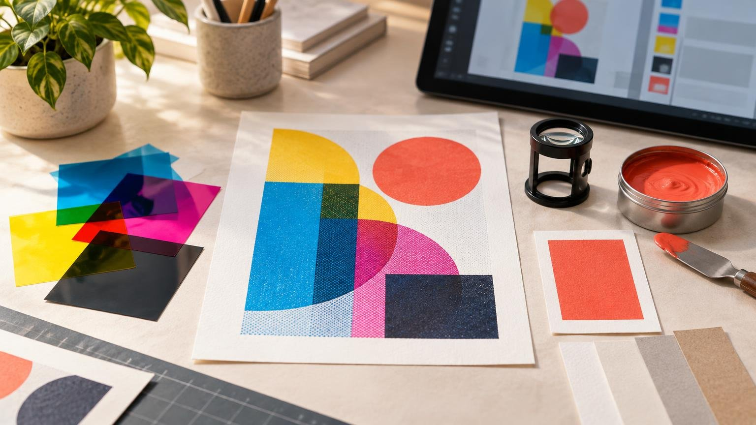
Spot colors and process colors describe two different ways to produce color in commercial printing. Process printing combines cyan, magenta, yellow, and black inks to create a broad range of colors. Spot-color printing assigns a separate ink or production separation to a specific color.
For creators, the practical decision is straightforward: use process color for photographs, paintings, gradients, and artwork containing many colors. Consider a spot color when one exact brand color, a specialty ink, or a production effect needs its own separation. A job can also use both methods.
TL;DR: Which color method should you use?
- Choose process color for photographs, detailed illustrations, gradients, and designs containing many colors.
- Choose spot color when the printer will use a separately mixed ink or when a specialty effect such as metallic ink or selective varnish needs a dedicated separation.
- Use CMYK plus a spot color when the artwork needs full-color imagery and one controlled brand color or special effect.
- Confirm whether the printer will produce a real spot ink or simulate the named spot color with process inks. The file can look similar in either case, but the physical printing method is different.
- Request an appropriate proof. A calibrated screen preview helps identify likely changes, but it does not show every effect of ink, paper, coating, or production setup.
What process color means
Process-color printing produces an image by combining percentages of cyan, magenta, yellow, and black. These four channels are commonly abbreviated as CMYK. Halftone dots from the channels overlap visually, allowing a press or printer to reproduce photographs and complex artwork without mixing a separate ink for every visible color. Adobe’s guide to spot and process colors describes CMYK as the standard process approach for artwork containing many colors.
Imagine a poster containing a photograph, blue sky, skin tones, orange lettering, and a painted background. Producing every visible shade as a separately mixed ink would be impractical. CMYK separates the image into four reusable channels instead.
The important word is “combines.” A process orange is not one orange ink. It is usually built from defined percentages of process inks. Its printed appearance therefore depends on the CMYK values, the output profile, the color-management workflow, the printing device, and the paper.
RGB and Lab artwork can be converted into process values during color separation. The result is not determined by the source color alone: the destination profile and conversion settings also affect the CMYK values produced. This is why two exports of the same bright RGB illustration can show different changes in saturated blues, greens, or shadows.
What a spot color means
A traditional spot color is a separately mixed ink printed instead of, or alongside, the standard CMYK inks. Each spot color creates its own plate or separation in a conventional commercial-print workflow.
Suppose a package design contains a photograph and a distinctive company orange. The photograph can use CMYK, while the orange can be assigned to a separately mixed spot ink. The resulting job has the four process separations plus an additional orange separation.
Spot colors also support effects that ordinary CMYK cannot represent as four-color ink mixtures. Metallic ink, opaque white ink, fluorescent ink, and selective varnish may all require dedicated separations, depending on the provider and production method. In these cases, the spot channel does more than specify appearance: it tells production where a special ink, coating, or effect belongs.
A spot swatch’s on-screen numbers are a simulation of the intended color. They are not the physical recipe for the ink that will reach the paper. The final result depends on the ink selected or mixed by the printer, the substrate, and the production conditions.
Spot colors vs process colors at a glance
| Question | Process color | Spot color |
|---|---|---|
| How is color produced? | By combining CMYK process inks | By using a dedicated ink or production separation |
| What artwork suits it? | Photographs, gradients, paintings, and many-color designs | Controlled brand colors and designated specialty effects |
| How many separations? | Normally four for CMYK | One for each spot color, in addition to any process channels |
| Can it reproduce every visible color? | No; output is limited by the selected process and print condition | A selected ink may reach colors or effects unavailable in ordinary CMYK |
| What must be confirmed? | Output profile, ink limit, PDF requirements, and proofing method | Whether the provider prints a real spot ink, supports the effect, and requires a particular swatch name or layer |
| Can both methods appear in one job? | Yes | Yes; spot separations can accompany CMYK |
When process color is the better choice
Process color is generally the practical choice when continuous variation matters more than matching one isolated color. Photographs contain thousands or millions of sampled colors. Digital paintings may include textured brushes, soft shadows, transparency, and blended light. CMYK is designed to separate that complexity into a manageable production system.
Process color also makes sense when the selected printer produces the entire job through a process-only digital workflow. Some providers accept named spot colors but convert or simulate them through the device’s available inks. A swatch named after a spot-color library does not prove that a separately mixed ink will be used.
Expanded-gamut systems may add inks beyond standard CMYK to reproduce a larger range of colors. That remains a provider-specific, color-managed process rather than permission to invent extra channels in the file. If your printer offers this route, see the practical guide to expanded color gamut printing before changing the artwork.
When a spot color earns its place
A spot ink is most useful when the separate ink solves a defined production problem. One common example is a brand color that falls outside the printer’s normal CMYK gamut or needs tighter control across repeated work. Another is a specialty effect that cannot be represented by ordinary process values.
Spot colors can also simplify limited-color artwork. A two-color poster made from black and one vivid ink may need only two separations rather than a full CMYK setup. Whether that reduces cost depends on the press, quantity, setup, and provider; it is not a universal pricing rule.
Avoid adding spot swatches merely because their names sound more precise. If the printer converts every submitted color to CMYK, an unused spot setup can create confusion without improving the result. Ask what the provider supports before building the final file.
How paper and production conditions change color
The same numeric color can look different when the paper or production mode changes. A glossy white sheet can support a different visual result from a warm, uncoated, or textured stock. Surface reflectance, paper color, ink absorption, and the printing condition all influence what reaches your eyes.
WhatTheyThink explains that a useful process-color guide for calibrated inkjet production must represent the actual paper, ink, device, production settings, and print mode. A CMYK combination selected from a guide made under different conditions may not produce the same result. Read the process-color guide discussion from WhatTheyThink.
This has a direct consequence for artists: do not treat a CMYK formula as a universal physical color. A dark teal that works on one coated sheet may become duller or darker on another. If the color is important, obtain the provider’s output profile or reference material and evaluate an appropriate proof.
The distinction also applies to spot inks. A separately mixed ink offers direct control over the ink selection, but the paper still affects the final appearance. An opaque or metallic ink may also behave differently from a conventional transparent printing ink.
A creator-centered file setup workflow
1. Decide what needs to remain visually controlled
Start with the design rather than the swatches panel. Identify photographs, painted passages, gradients, logos, brand colors, and special finishes. Ask which elements can be reproduced as ordinary process color and which, if any, require a separate production instruction.
For a full-color event invitation, CMYK may handle the entire design. For packaging with a photograph and metallic emblem, the photograph may use CMYK while the emblem uses a dedicated spot separation. The physical effect determines the file structure.
2. Get the printer’s specifications before final separation
Ask the provider whether it supports real spot inks, which color libraries or naming conventions it accepts, and whether spot colors will be converted to process. For specialty effects, request instructions for swatch names, layers, overprint settings, minimum line weights, knockout behavior, and PDF export.
Also confirm the required output profile, total ink limit, PDF standard, and proofing options. These are workflow-specific details. Adobe describes a 300%–320% ink-limit range as typical in some contexts, but that is not a universal value to apply to every file.
When comparing custom printing and print-product options, look beyond the product name and check whether the production process actually supports the color separation or specialty effect in your artwork.
3. Build deliberate swatches
Use named, global swatches where the software and workflow support them. In Illustrator, new swatches default to process colors, while spot colors are treated as global swatches. A consistent swatch lets you update repeated artwork without hunting for every object and reduces the chance that visually similar elements acquire slightly different values.
Keep the swatch type intentional. A process swatch tells the workflow to separate the color through process channels. A spot swatch creates an additional separation unless it is converted later. Two swatches can look identical on screen while producing different separation structures.
4. Inspect the separations
A separation preview helps reveal whether an object appears on the expected plate. Turn process channels and spot channels on and off individually. A logo intended for one spot ink should not unexpectedly appear across CMYK plates, and an effect meant to print only in varnish should not introduce visible process color.
Adobe says Illustrator’s Separations Preview can display individual inks or plates, rich black, overprinting, blends, and transparency behavior in a CMYK document. It remains a screen preview and does not preview trapping, printer’s marks, halftone screens, or output resolution. Adobe’s Separations Preview documentation explains those limits.
InDesign similarly displays each spot color beyond CMYK as a separate plate. Adobe notes that converting a spot color to process may reduce production cost but can affect brand-color accuracy, so important corporate or specialty colors should be discussed with the print provider before conversion. For a broader document check, follow the InDesign print-file preparation workflow.
5. Check overprint, transparency, and small details
Spot effects often interact with overprint and knockout settings. An overprinting spot varnish may be intentional; overprinting light lettering onto a dark background may create an unwanted result. Transparency and blending can also cause an ostensibly simple spot element to involve process plates after flattening or output conversion.
Inspect fine type, thin lines, gradients, and raster effects at final physical size. A vector spot-color logo remains scalable, but a raster texture placed inside it still has a resolution tied to output dimensions. Spot status does not make raster artwork resolution-independent.
6. Export using the provider’s preset
Do not use one universal PDF recipe for every printer. Follow the provider’s current requirements for PDF standard, color conversion, profile inclusion, bleed, marks, transparency, and spot-color handling. A setting that preserves spot plates for one offset workflow may be unnecessary or incorrect for a process-only digital service.
After export, inspect the PDF in a tool that can display output separations. Confirm the expected number and names of plates. Recheck page size, bleed, fonts, images, and transparency at the same time; correct color separations do not rescue an otherwise incomplete print file.
Proof the physical result, not just the file structure
A separation preview answers “Where will this element print?” It does not completely answer “What will this ink look like on this paper?” Soft proofing can simulate a documented print condition on a calibrated display, making it useful for identifying likely gamut and contrast changes. The soft-proofing guide for print explains how to interpret that simulation without mistaking it for the finished sheet.
Request a physical proof when an exact color, dark tonal detail, subtle neutral, paper interaction, or specialty effect matters. Ask whether the proof uses the intended press, ink, substrate, and finishing process. Some proofs verify layout and content more effectively than final color or finish.
Review the proof under suitable lighting and compare it with the intended reference. Check the critical color, but also inspect adjacent colors, small text, gradients, overprints, knockouts, and shadows. The guide to print proofs can help you choose what to approve and what to question.
The practical decision
Choose process color when the artwork needs flexible reproduction of photographs, gradients, and many hues. Choose a spot color when a separately controlled ink or production effect serves a clear purpose. Combine them when full-color artwork and one critical or specialty element must coexist.
Most preventable mistakes happen when the file label and production method are assumed to be the same thing. A named spot swatch may be converted to CMYK, while a visually ordinary shape may represent varnish, white ink, or another special separation. Confirm the printer’s method, build the swatches deliberately, inspect the exported plates, and approve the right kind of proof. That sequence turns an abstract color choice into a dependable print workflow.