
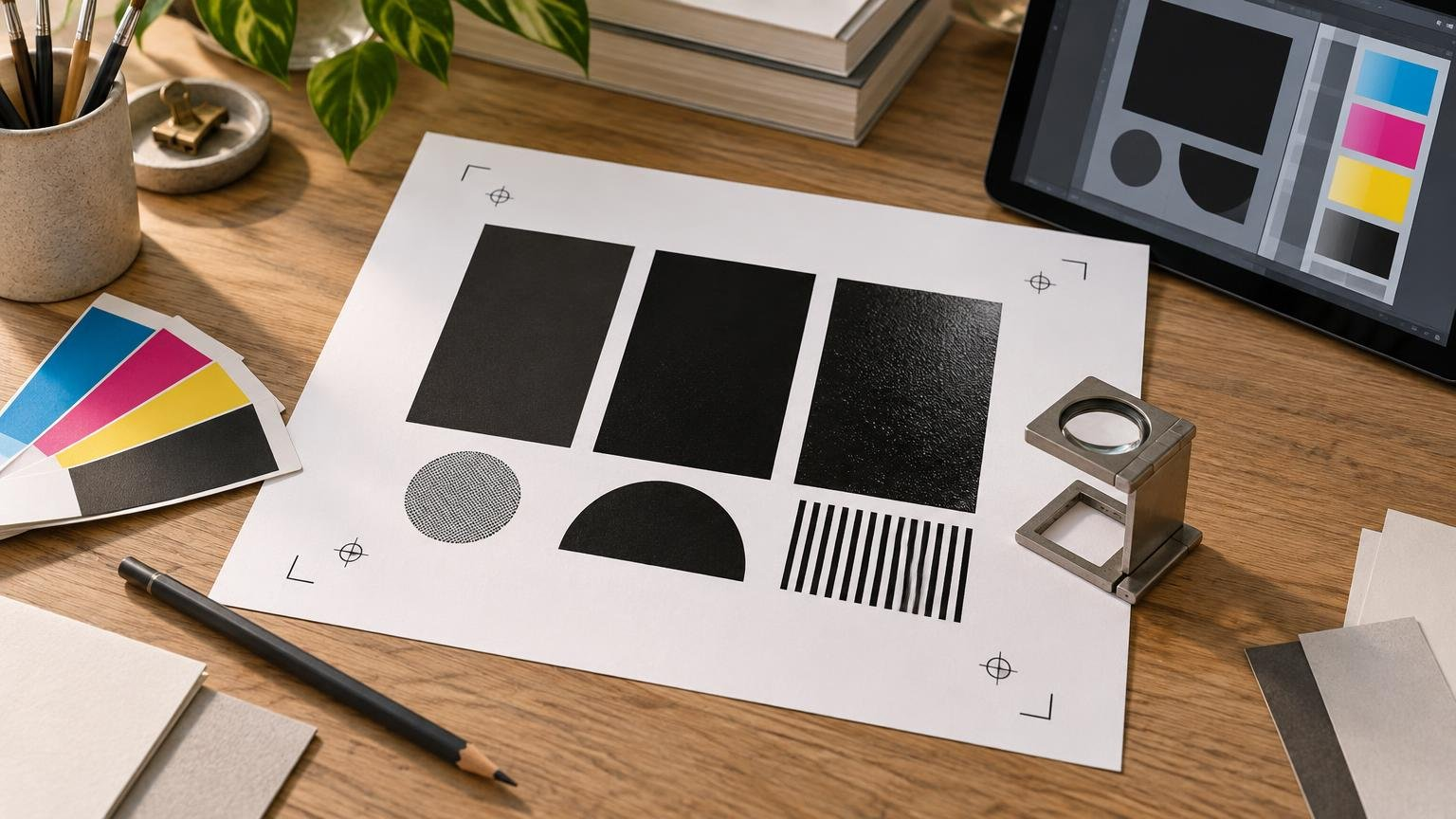
TLDR: choose black by the size and purpose of the object
The essential registration black vs rich black distinction is simple: registration black is a production color that appears on every separation plate, while rich black is an intentional mixture of process black with one or more CMY inks. Do not use the [Registration] swatch for artwork. Use black-only, commonly called 100K, for small text, thin rules, barcodes, QR codes, and other alignment-sensitive details unless your printer says otherwise. Consider rich black for large dark fields or display elements, but only with a build approved for the destination press and paper.
That choice matters because a black object on screen may be produced with one ink or several. A small line made from four inks depends on those inks aligning precisely. A large field made from registration color can place far more ink on the substrate than intended. The right black is therefore not simply the darkest-looking swatch; it is the black construction appropriate to the object and production process.
Registration black vs rich black at a glance
| Black type | How it is built | Typical purpose | Main risk |
|---|---|---|---|
| Registration black | Outputs on every separation plate | Small production marks such as registration targets | Excessive coverage when used in artwork |
| 100K process black | Black plate only | Small text, thin rules, fine details, codes and many ordinary elements | May appear less dense than an approved multi-ink black across a large field |
| Rich black | Black plus selected cyan, magenta and/or yellow | Printer-approved large black areas or large display type | Colored edges, excess ink or poor drying if used or specified incorrectly |
These are production categories rather than universal visual recipes. Two blacks can look similar on a monitor yet separate very differently. Conversely, two files using the same CMYK percentages can print differently on coated paper, uncoated stock, a digital press, or another printing condition.
What registration black actually does
In InDesign, the [Registration] color is designed to print on every separation plate. That behavior lets a registration target remain visible for each process color or spot-color plate. Adobe advises limiting it to small production elements such as registration targets and trim marks because using it across large areas can produce excessive ink coverage and production problems. Adobe also explicitly distinguishes registration color from rich black. Adobe’s explanation of all-plate printing shows why [Registration] is a technical swatch, not a stronger artwork black.
Imagine a document with cyan, magenta, yellow, black and two spot colors. An object colored [Registration] can appear on all of those separations. It is not merely C100 M100 Y100 K100 in a fixed four-color sense; its purpose is to follow the plates used by the job. That makes it useful for production marks and hazardous as a background, logo fill, poster field or sticker shape.
Changing an artwork object to [Registration] because ordinary black looks weak on screen solves the wrong problem. Screen display is not a reliable measure of printed density, and an all-plate object can introduce ink coverage that the substrate and press were not intended to handle. If a large area needs greater printed depth, ask for an approved rich-black build instead.
How 100K process black differs from rich black
100K uses the black separation
A conventional 100K black is C0 M0 Y0 K100 in a CMYK workflow. Because it relies on the black plate rather than several plates, it is generally the safer construction for fine text and narrow details. If there is minor plate-to-plate alignment variation elsewhere in the job, a black-only letter does not acquire cyan or magenta fringes from supporting inks that were never part of the letter.
This is especially important for a small copyright line, contact details on a card, a delicate black keyline, or the modules and quiet-area boundaries of a machine-readable code. Keep such objects simple and inspect them in the exported PDF. Do not assume that an object is black-only merely because it appears neutral on the artboard.
Adobe documents that InDesign overprints 100% black fills and strokes by default, subject to the relevant application setting and output workflow. Overprinting can help avoid visible gaps around small black elements, but it also changes how those elements interact with colors beneath them. Inspect the intended result rather than treating overprint as a universal repair. A black object that must knock out, or one placed over a variable background, deserves particular attention.
Rich black uses supporting process inks
Rich black combines process black with selected amounts of cyan, magenta and/or yellow. It is often considered for a broad background, a large display word, or another substantial dark shape where a printer-approved multi-ink construction can create the intended result. Adobe recommends obtaining the percentages from the print provider for the specific press and paper.
There is no responsible universal formula to copy into every file. A build suitable for one coated offset condition may exceed the preferred total area coverage for an uncoated stock or a different digital process. The proportions can also influence whether the black feels neutral, cool or warm. The correct question is not “What is the rich-black formula?” but “What rich-black build does this provider want for this product, process and substrate?”
Why rich-black type can develop colored edges
A multi-ink black asks several printed colors to occupy the same shape. On a large field, small alignment variation may be difficult to notice. On an eight-point letter or hairline rule, the same variation can reveal a cyan, magenta or yellow edge. The text may look soft even though the source artwork is vector-based and technically sharp.
This is why vector scalability does not eliminate every print risk. Vectors preserve geometric edges, but the physical result still depends on how many inks form those edges and how accurately the printing process aligns them. Changing small type from rich black to black-only removes the unnecessary supporting plates from that object.
Barcodes and QR codes deserve similar caution. Their usefulness depends on clean contrast and geometry, so a black-only construction is a sensible default unless the printer supplies different product-specific instructions. Do not add CMY simply to make a code look darker on your monitor.
How profiles and total ink coverage affect the decision
Total area coverage is the combined amount of process ink assigned at a location. Adding more channels can increase that total, but the acceptable limit is not identical across all jobs. Paper absorption, coating, press behavior, drying, finishing and the printer’s color-management workflow all matter. Too much ink can contribute to production difficulties and loss of useful shadow distinction.
A document’s CMYK mode alone does not establish the correct output condition. The destination profile describes a particular printing condition, while the black recipe is an object-level color choice inside that workflow. PRINTING United Alliance provides GRACoL datasets and ICC profiles for multiple conditions, including coated, uncoated, offset, digital and expanded-gamut workflows. That variety is a useful reminder that “CMYK” is not one universal press behavior.
Do not convert blindly to a profile found online. Obtain the printer’s current specifications, including any supplied profile, preferred PDF preset, rich-black recipe and ink-coverage guidance. Before placing an order through a commercial print provider such as Printiverse, ask which black construction is expected for large fields and whether the provider performs its own conversion.
A practical preflight workflow
Check both the editable source and the exported PDF. The source file helps you correct the design; the PDF shows the data you are actually preparing to submit. For a wider document check covering images, fonts, bleed and export settings, use TutorArt’s guide to preparing InDesign files for printing.
- Open the swatches or color controls and identify every black used in the artwork. Look specifically for accidental [Registration] assignments and unnamed four-color blacks.
- Check small text, fine rules, logos, barcodes and QR codes. Unless the printer directs otherwise, make alignment-sensitive black details black-only rather than multi-ink.
- Review large black backgrounds and display elements. If they use a rich black, compare the percentages with the printer’s current specification instead of relying on a remembered recipe.
- Inspect separations in the application’s separation or output-preview tools. Turn plates on and off. Small black-only text should disappear when the black plate is hidden; an accidental registration-colored object will remain present across every active separation.
- Export using the provider’s requested PDF standard and settings. Then inspect the exported PDF with a suitable output-preview tool where available. Adobe documents Output Preview in Acrobat Pro for examining production output.
- Review overprint behavior, spot-color plates and total ink warnings when the available tools support those checks. Pay special attention to black elements crossing colored backgrounds.
- Read the printer’s automated preflight result or proof, but do not treat a normal-looking composite preview as proof that the separations are correct. Ask the provider about anything ambiguous before approving production.
If you are new to trim, safe areas, image resolution and export formats, review print design basics for bleed, margins, resolution and file types as a separate pass. Correct black construction cannot compensate for missing bleed, undersized images or text placed too close to the trim.
Fast decision guide
- Production registration target or another printer-controlled all-plate mark: use registration color only where the workflow requires it.
- Small body text, captions, thin rules or intricate details: start with 100K black.
- Barcode or QR code: favor a clean black-only construction unless the provider gives a different specification.
- Large black background or large display element: ask the printer whether to use rich black and request the exact build.
- Logo used at many sizes: create production variants as needed; do not force one multi-ink black into tiny and large applications.
- Any artwork background currently set to [Registration]: replace it before submission and inspect the separations again.
- Unknown destination process or paper: do not guess a rich-black recipe; obtain the production specification first.
The safest takeaway
Registration black is not an extra-dark design color. It is an all-plate production color intended for small technical marks. Rich black is a controlled mixture for selected artwork, and 100K is the practical default for many fine, alignment-sensitive black elements.
Before sending the job, inspect the separations rather than judging black from the composite screen view. Remove [Registration] from artwork, confirm that small details are black-only, and verify any rich-black build with the printer for the actual press and substrate. That short check prevents the most consequential registration black vs rich black mistakes before pixels and vectors become ink on paper.