Color Palette Practice For Beginner Artists sounds like the kind of thing that should be easy. Pick some pretty colors, place them next to each other, feel like a design genius for four seconds, then wonder why everything suddenly looks like cereal box chaos.
That is normal.
Color is one of the most powerful parts of art and design, but it can also be weirdly slippery. A sketch can have good shapes, good proportions and a nice idea, then the colors show up wearing clown shoes. The good news is that color gets easier when you practice it on purpose instead of waiting for “taste” to magically arrive like a fairy godmother with a Pantone deck.
What Is A Color Palette?
A color palette is a small group of colors chosen to work together. That is it. No mystical gatekeeping required.
For beginner artists, a palette helps you stop choosing every color from scratch. Instead of wandering through the color picker like a lost raccoon in a craft store, you give yourself a limited set of choices.
A basic palette might include:
One main color
One supporting color
One accent color
One light neutral
One dark neutral
That small setup is enough for sketches, sticker designs, character art, posters, simple logos, social posts and brand experiments. It also teaches an important lesson: good color usually comes from relationships, not from one perfect color.
A blue is not just “good” or “bad.” It changes depending on what sits next to it.
Why Beginner Artists Should Practice Color Palettes
Color palette practice builds three useful skills at the same time.
First, it teaches control. You learn how to make colors feel connected instead of random.
Second, it teaches contrast. You learn which colors separate clearly and which ones turn into visual soup.
Third, it teaches design thinking. A palette is not only about beauty. It affects mood, readability, brand style and whether a printed sticker or card still looks good when it is small.
That last part matters. A palette that looks lovely as a giant digital painting may fail on a two-inch sticker. Tiny text, low contrast colors and overly subtle details do not become more charming when printed small. They become invisible. Very classy invisibility, perhaps, but still invisible.
Learn The Three Color Basics First
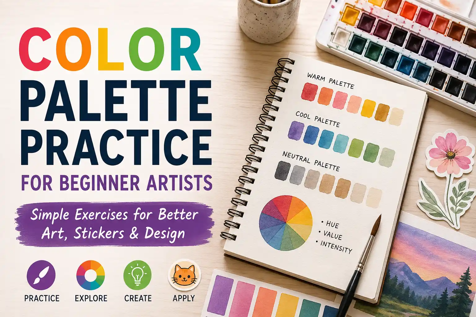
Before making palettes, beginner artists should understand three simple color traits: hue, value and intensity.
Hue is the color family, like red, yellow, green or blue.
Value is how light or dark the color is.
Intensity is how bright or dull the color feels.
Value is the one beginners underestimate most. A palette can have beautiful hues and still fail if the values are too similar. If every color is medium-light, the design may look soft but unclear. If every color is dark, it may look heavy. If every color is screaming at full brightness, congratulations, you have invented eye noise.
A quick test helps: turn your artwork grayscale. If the important shapes still read, your values are probably working. If everything blends together, the palette needs more light-dark contrast.
Start With Limited Palettes
The easiest way to get better at color is to use fewer colors.
Try limiting yourself to three to five colors per study. This forces you to make decisions. It also keeps the practice small enough to actually finish, which is important because “make 40 perfect color studies” is how a sketchbook becomes a guilt rectangle.
A good beginner setup is:
Dark color for outlines, shadows or strong text
Light color for backgrounds or highlights
Main color for the subject
Accent color for small moments of emphasis
Optional neutral for balance
Use the accent color sparingly. If everything is an accent, nothing is. That is not a design rule as much as a life lesson with saturation.
Practice Exercise 1: Value-First Palettes
Pick one object, character, sticker idea or simple scene. Before choosing full color, make three tiny grayscale thumbnails.
One light palette
One medium palette
One high-contrast palette
After that, add color while keeping the same value structure. For example, your dark value might become navy, forest green or deep purple. Your light value might become cream, pale blue or soft pink.
The point is not to make a masterpiece. The point is to separate value from hue. This is where a lot of color confusion starts. Beginners often change the hue when the real problem is value.
Practice Exercise 2: Three-Color Sticker Studies
This exercise is great for artists who want their work to become stickers, labels, cards or printed merch.
Choose one simple design. It could be a cat, a flower, a skull, a coffee cup, a mushroom, a tiny dragon or whatever your sketchbook is currently obsessed with.
Now make the same design three times using only:
One background color
One main subject color
One accent color
Keep the line art or darkest detail consistent if needed.
After finishing, ask:
Which version reads best from far away?
Which version feels most like the subject?
Which one would work as a sticker?
Which one would still look good at two or three inches wide?
This forces you to think like both an artist and a designer. Art can invite someone in slowly. Stickers and labels often need to work fast.
Practice Exercise 3: Pull A Palette From A Reference
Choose a photo, painting, movie still, package design or piece of art you like. Do not copy the artwork. Just study the color.
Pick five colors from it:
Darkest useful color
Lightest useful color
Main color
Secondary color
Small accent color
Then use those colors in a different drawing.
This is one of the best beginner exercises because it teaches you to notice real color relationships. Nature, film, product packaging and good illustration already contain thousands of useful palettes. Your job is to study them without turning the exercise into “copy the whole thing and hope nobody notices.”
For extra practice, label the palette mood. Is it calm, playful, vintage, spooky, clean, premium, earthy, loud, soft or energetic?
That vocabulary helps when you start designing for a purpose.
Practice Exercise 4: Make One Palette Fit Three Uses
This exercise connects art fundamentals with brand design.
Create a five-color palette. Then use it for three tiny projects:
A character sketch
A sticker concept
A simple brand card or label
Keep the same colors, but change the proportions.
For the character sketch, the main color might dominate.
For the sticker, you may need stronger contrast and a bolder outline.
For the brand card, you may use more neutral space so the text stays readable.
This teaches a big design truth: a palette is not only the colors. It is also how much of each color you use.
A palette that is 70 percent cream, 20 percent green and 10 percent coral feels very different from one that is 70 percent coral, 20 percent green and 10 percent cream. Same ingredients. Different soup.
Practice Exercise 5: Build A Brand-Inspired Palette
Pick a fake brand. Keep it simple.
Examples:
A cozy tea shop
A punk sticker brand
A handmade candle label
A fantasy art print series
A kids’ art class
A retro arcade cabinet
Now choose colors that match the personality.
A cozy tea shop might use warm browns, cream, muted green and a soft accent.
A punk sticker brand might use black, hot pink, acid green and white.
A fantasy art print series might use deep blue, gold, warm gray and pale lavender.
After making the palette, create one small design with it. Then ask whether the colors match the brand without needing a paragraph of explanation. If the fake tea shop looks like a sports energy drink, adjust.
Easy Color Harmony Recipes
Color harmony is the relationship between colors on the color wheel. You do not need to memorize every theory term before making art, but these recipes help.
Monochromatic Palette
A monochromatic palette uses variations of one hue. For example, light blue, medium blue, dark blue and navy.
This is good for calm designs, soft illustrations and beginner studies because it removes a lot of decision fatigue.
The risk is boredom. Add value contrast so it does not become one polite blob.
Analogous Palette
An analogous palette uses colors near each other on the color wheel, like yellow, yellow-green and green.
This usually feels harmonious and natural. It is great for landscapes, cozy artwork and designs that should feel unified.
The risk is weak contrast. Add a dark neutral or a small accent if the design needs to pop.
Complementary Palette
A complementary palette uses colors opposite each other on the color wheel, like blue and orange or purple and yellow.
This can create strong energy and visual contrast. It works well for stickers, posters and bold character designs.
The risk is too much fighting. Let one color lead and use the other as the accent.
Triadic Palette
A triadic palette uses three colors spaced around the color wheel, like red, yellow and blue.
This can feel playful and balanced. It is useful for cartoon art, kid-friendly designs and energetic branding.
The risk is looking too primary-school if all three colors are equally bright. Adjust the values and intensity so the palette feels more intentional.
How To Test If A Palette Works
Do not judge a palette only by staring at the color swatches. Swatches can lie by omission. They look neat in a row, then turn feral inside an actual design.
Test the palette in use.
Try these checks:
Convert the design to grayscale. Does it still read?
Shrink it down. Can you still understand it?
Blur your eyes. What stands out first?
Put text on it. Is the text readable?
Print a small test if the design is meant for stickers, labels, cards or art prints.
The small-size test is especially helpful. Many beginner palettes are too subtle for print design. Light peach on cream may feel elegant on a monitor, but on a tiny sticker it can look like the printer simply gave up.
Common Beginner Color Mistakes
Using Too Many Colors
More colors do not automatically make art more interesting. Often they just make the viewer do more work.
Start with fewer colors. Add only when the design needs it.
Ignoring Value
If the lightness and darkness are too similar, the design will feel flat or hard to read.
Check your values early. It is much easier than repainting the whole thing later while muttering at your screen.
Making Every Color Fully Saturated
Bright colors are useful. All-bright palettes are exhausting.
Try muting some colors so your accent color has room to shine.
Choosing Colors Without A Purpose
A palette should support the idea. Cute, eerie, elegant, childish, rugged and luxurious all need different color decisions.
Before picking colors, write down three words that describe the mood.
Forgetting The Final Format
A palette for a digital painting is not always right for a sticker, logo, label or business card.
Print needs clear contrast, readable text and colors that still work at real size. Digital art can sometimes get away with more glow, subtle gradients and tiny shifts.
A Simple Weekly Practice Plan
Here is a beginner-friendly plan that does not require buying 87 markers, a new tablet or a suspiciously expensive course from someone who says “creative journey” too often.
Day 1: Grayscale Value Studies
Make five small value thumbnails using only black, white and gray.
Day 2: Three-Color Palettes
Choose three colors and make five tiny designs.
Day 3: Reference Palette Study
Pull five colors from a reference image and use them in a new sketch.
Day 4: Warm Vs Cool
Make one warm version and one cool version of the same drawing.
Day 5: Sticker Readability Test
Design a small sticker concept and check if it works when reduced in size.
Day 6: Brand Palette Test
Create a fake brand palette and use it on a simple label, card or social graphic.
Day 7: Review And Repeat
Pick your best palette of the week. Write down why it worked. Pick the weakest one and fix only one thing.
That last part matters. Do not just make more work. Review the work. Practice without review is just repetition wearing a tiny fake mustache.
Color Palette Practice For Print And Stickers
Color Palette Practice For Beginner Artists becomes more useful when you connect it to real projects.
If you are making stickers, use bold shapes and clear contrast. Your palette should support the silhouette of the design. A cute character with a muddy outline may look fine on a full-size screen, but once it becomes a die-cut sticker, the edge matters.
If you are making labels, readability comes first. The product name, flavor, scent, size or main message should be easy to find. Color can create personality, but it should not bury the information.
If you are making business cards or brand materials, consistency matters. Use the same palette across the logo, card, packaging, website and social graphics when possible. That repetition helps the brand feel intentional instead of assembled during a mild panic.
If you are making art prints, you can be more subtle, but still test the palette. Screens glow. Paper does not. Some bright digital colors may print less intensely, especially when moving between RGB screen color and CMYK print processes.
How To Know You Are Improving
You are getting better at color palettes when:
Your designs read clearly at small sizes
You can explain why you chose each color
Your colors support the mood instead of fighting it
You use accents more carefully
Your grayscale version still works
You can make several palettes for the same sketch without starting over
Improvement may feel slow because color taste develops through comparison. That is why palette practice works so well. It gives you a pile of small comparisons instead of one giant finished piece with too much emotional baggage attached.
Final Thoughts
Color is not just decoration. It affects mood, structure, readability, print quality and brand recognition. That is why color palette practice belongs in a beginner art routine right next to drawing practice and reference study.
Start small. Use limited palettes. Check value. Test your colors in real designs. And remember, ugly color studies are not failures. They are data. Slightly offensive data sometimes, but still useful.
The goal is not to find one perfect palette and use it forever. The goal is to build enough color confidence that you can make better choices on purpose.