If you are wondering what to put on an artist business card, the answer is not “every possible way someone could contact you since 2009.” Please do not make your business card a tiny filing cabinet. A good artist business card should do one simple job: help someone remember your work and take the next step.
That next step might be buying from your shop, following your Instagram, commissioning a portrait, booking a tattoo consultation, visiting your booth again later or emailing you about a project. Different artists need different cards, but the best ones are clear, useful and easy to act on.
An artist business card is not just a networking formality. For markets, art fairs, gallery nights, student shows and online shop packaging, it can quietly do a lot of work. It can remind someone who you are after they walk past thirty booths, get handed five stickers and forget where they parked. Memory is fragile. Good print design helps.
Start With The Job Of The Card
Before choosing fonts, paper or finishes, decide what the card is supposed to do.
Most artist business cards fall into one of these jobs:
- Help people follow your work online
- Send buyers to your shop
- Encourage commissions
- Support gallery or show networking
- Make your packaging feel more professional
- Give local customers a way to contact you later
- Make your booth or table feel more finished
That choice changes everything. A card for a fine artist trying to connect with galleries should not look exactly like a card for a sticker artist selling at weekend markets. One needs credibility and contact clarity. The other may need personality, a QR code and a shop link that people can scan while holding a lemonade.
The mistake is trying to make one card do every job at once. That is how you end up with five social icons, three emails, a bio, a quote, a tiny image, a QR code, a discount code and a font size normally reserved for legal disclaimers.
Pick the main job first. Then build the card around that.
The Essential Information Every Artist Business Card Needs
When deciding what to put on an artist business card, start with the basics. These are the pieces of information that help someone understand who you are, what you make and how to find you.
Artist Name Or Studio Name
Use the name people will actually search for. If you sell under a studio name, lead with that. If your personal name is your brand, use it clearly.
Good examples:
- Maya Chen Illustration
- Bright Fox Studio
- Daniel Reyes Fine Art
- Ink Garden Tattoo
- June Carter Ceramics
Avoid making your name so stylized that people cannot read it. A business card is allowed to be beautiful, but it still has to work as a business card. Annoying, i know.
A Short Description Of What You Make
Add a one-line descriptor if your name does not make your work obvious.
Examples:
- Botanical watercolor prints
- Fantasy character illustration
- Custom pet portraits
- Handmade ceramic jewelry
- Tattoo flash and custom designs
- Local landscape paintings
- Stickers, prints and cute chaos
This line is especially helpful at craft fairs and conventions. Someone might like your booth but forget whether you were the cat sticker person, the mushroom print person or the person selling tiny ceramic frogs with judgmental expressions.
Website, Shop Or Portfolio Link
Your card should send people somewhere useful. For most artists, that should be one primary destination.
Best options:
- Personal website
- Online shop
- Portfolio page
- Etsy shop
- Shopify store
- Commission form
- Link-in-bio page
Choose the cleanest link. If your URL is long, messy or impossible to type, use a QR code and a short printed version of the link.
For example:
- brightfoxstudio.com
- brightfoxstudio.com/shop
- brightfoxstudio.com/commissions
Do not make people type a 47-character marketplace URL with random numbers in it. That is not marketing. That is punishment.
Email Address
Email still matters, especially for commissions, wholesale, gallery contact, art licensing and custom work.
Use a professional-looking email if possible.
Better:
Still acceptable:
Less ideal:
We all had phases. Your business card does not need to preserve them.
Social Handle
Include one or two social handles at most. For artists, Instagram, TikTok, Pinterest, YouTube or Behance may make sense, depending on where your audience actually finds you.
The key is restraint. If you include every platform, nobody knows where to go first.
A simple format works:
@brightfoxstudio
If your handle is the same everywhere, you can write:
@brightfoxstudio on Instagram and TikTok
That is enough.
Location, If It Matters
You do not need to print your home address. In most cases, please do not.
But location can help if your work is local, event-based or service-based.
Examples:
- Salt Lake City artist
- Utah pet portraits
- Denver tattoo artist
- Available for local murals
- Artist based in Portland, shipping worldwide
Location gives context without giving strangers directions to your house. Excellent compromise.
QR Code
A QR code can be very useful, but only if it points somewhere helpful.
Good QR code destinations:
- Shop page
- Portfolio
- Commission request form
- Mailing list signup
- Current show page
- Link-in-bio landing page
- Contact form
Label the QR code so people know what they are scanning.
Good labels:
- Scan to shop prints
- Scan for commissions
- View my portfolio
- Join my mailing list
- Follow my work
Bad label:
- Scan me
Scan you for what? A coupon? A curse? A mildly disappointing menu? Be specific.
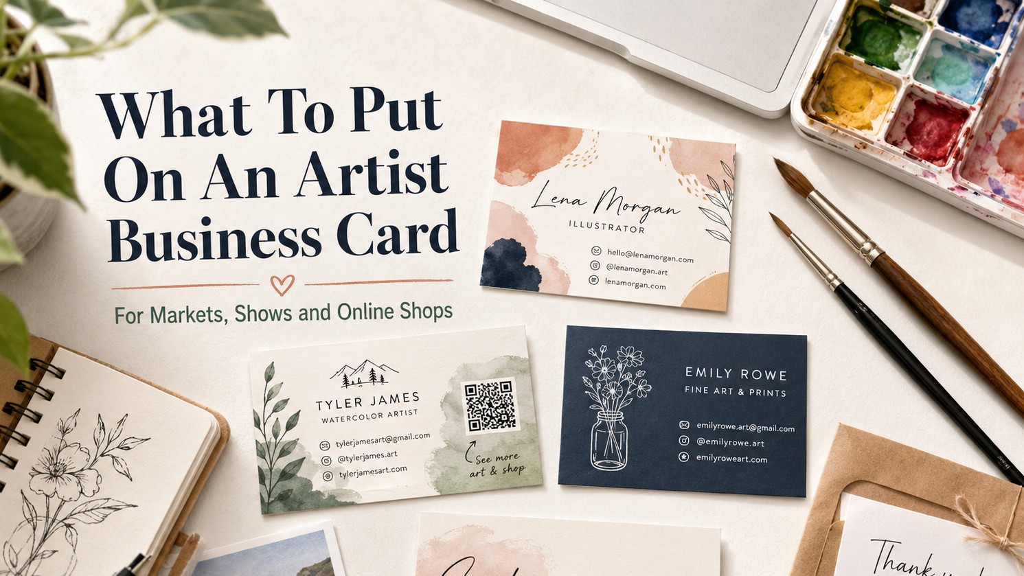
What To Put On The Front Of An Artist Business Card
The front of the card should be the fastest read. Think of it as the “recognize me later” side.
For most artists, the front should include:
- Artist or studio name
- One strong visual element
- Short descriptor
- Main website or handle
The visual can be your logo, a small artwork detail, a simple pattern, a character, a cropped painting, a clean monogram or a product-style image.
Do not cram your full portfolio onto the front. One good image is stronger than twelve tiny images fighting for oxygen.
Simple Front Layout For Artists
Name or studio name
Short description
Small artwork sample or logo
Website or handle
Example:
Bright Fox Studio
Whimsical animal prints and stickers
brightfoxstudio.com
@brightfoxstudio
That is simple. It works. It does not require someone to squint like they are reading the ingredients on a lip balm.
What To Put On The Back Of An Artist Business Card
The back of the card can be more useful. This is where you can add a QR code, service list, discount, event note or small call to action.
Good back-side ideas:
- QR code to shop
- QR code to commissions
- Short service list
- Small product photo
- “Thank you for supporting independent art”
- First-order discount code
- Mailing list invitation
- Upcoming show note
- Care instructions for handmade items
- Space to write a custom note
For artists who sell physical products, the back can do double duty as a packaging insert. If you include a card in every order, add something that encourages repeat contact.
Example:
Thanks for supporting my art.
Scan to see new prints, stickers and originals.
Use code ARTFRIEND for 10% off your next order.
This works better than a card that only says your name and then politely disappears into a drawer.
Business Card Ideas For Artists Selling At Craft Fairs
Craft fair cards need to be clear, fast and practical. People are walking, browsing, comparing prices, talking to friends and pretending they are “just looking” while clearly buying three candles.
For craft fairs, your card should help people find you again after the event.
Useful details:
- Artist name or shop name
- Main product category
- Online shop
- Instagram or TikTok handle
- QR code to shop
- Optional show-only discount code
- Optional local pickup or commission note
Craft Fair Artist Card Example
Front:
Maple Cat Studio
Cute stickers, prints and stationery
@maplecatstudio
Back:
Scan to shop after the market
maplecatstudio.com
Custom pet portraits open monthly
This gives the buyer a reason to keep the card. It also answers the question they will ask later: “Who was that artist with the raccoon sticker?”
Business Card Ideas For Illustrators And Designers
Illustrators and designers often benefit from a slightly more portfolio-driven card. You want the card to show taste, not just contact info.
For illustrators, consider:
- One strong illustration crop
- A clean name and title
- Portfolio website
- Email for project inquiries
- QR code to selected work
- A short specialty line
Example specialties:
- Editorial illustration
- Children’s book illustration
- Fantasy and game art
- Brand illustration
- Character design
- Surface pattern design
- Packaging illustration
If you offer client services, make the card look like you understand hierarchy, spacing and typography. This is unfair but true: your card becomes a small sample of your design judgment.
For designers, avoid novelty if it fights clarity. A clever card that hides your email is not clever. It is a tiny escape room.
Business Card Ideas For Fine Artists
Fine artists usually need a card that feels calm, serious and image-led. The artwork should carry the card, but the contact details still need to be readable.
Good information for fine artist cards:
- Artist name
- Medium or style
- Website
- Gallery representation, if relevant
- City or region, if relevant
Example:
Lena Ortiz
Oil paintings and western landscapes
lenaortizart.com
@lenaortizart
If you use an artwork image, choose one that survives small size. A detailed painting may look great on a wall and turn into a muddy postage stamp on a card. Cropped details often work better than full artwork thumbnails.
Use the back of the card for a larger art image if you want visual impact. Keep the front cleaner.
Business Card Ideas For Commission Artists
If commissions are your goal, say so clearly.
A commission-focused card should include:
- What kind of commissions you offer
- Where to request one
- How to view examples
- Your email or form
- Any basic availability note
Examples:
- Custom pet portraits
- Family illustrations
- Tattoo flash and custom pieces
- Character commissions
- Wedding venue paintings
- House portraits
- Logo and mascot design
Sample card copy:
Custom Pet Portraits
Watercolor and digital options available
Scan to view pricing and request a spot
This is much better than hoping someone guesses you take commissions because your art is nice. People are not mind readers. They are tired and holding a tote bag.
What Not To Put On An Artist Business Card
Sometimes the best design choice is deleting things.
Leave these off unless you truly need them:
- Home address
- Too many phone numbers
- Every social platform
- A full artist statement
- A long quote
- Tiny product thumbnails
- Low-resolution artwork
- A QR code with no explanation
- Hard-to-read script fonts
- A background that makes the text disappear
- Old branding you are not using anymore
Also avoid vague labels like “creator,” “maker” or “artist” if they do not explain what you actually do. Those words are fine in context, but a more specific phrase usually works harder.
“Ceramic jewelry and tiny sculptures” tells people more than “creative goods.”
“Fantasy illustration and character art” tells people more than “visual storyteller.”
Yes, “visual storyteller” sounds nice. It also sounds like the kind of phrase that could mean anything from children’s books to corporate PowerPoint decks.
Artist Business Card Design Tips Before Printing
Once you know what to put on the card, make sure the design is print-ready. This is where small mistakes get expensive.
Use A Readable Type Size
Small cards have small limits. Keep key contact information large enough to read without effort.
As a general rule, be careful with anything below 8 pt. Some fonts can survive small sizes. Some cannot. Thin script fonts and delicate serifs often get sketchy fast.
If the card includes older buyers, gallery contacts or normal humans who do not enjoy eye strain, go bigger.
Keep Strong Contrast
Dark gray text on a medium gray background may look tasteful on screen and completely useless in print.
High contrast is your friend.
Good combinations:
- Black text on white or cream
- White text on dark solid color
- Deep navy on pale blue
- Dark green on warm ivory
- Dark brown on kraft, if large enough
Be careful with:
- Light gray text
- Neon text
- Thin text over artwork
- Transparent overlays
- Busy backgrounds behind contact info
The art can be expressive. The contact info should be boringly readable.
Use The Standard Size Unless You Have A Reason Not To
In the United States, standard business cards are usually 3.5 inches by 2 inches. That size fits wallets, card holders and event setups.
Square cards can be great for artists because they feel more like mini art prints. They also work well for sticker artists, illustrators, ceramicists, tattoo artists and brands with a strong visual mark.
But odd shapes have tradeoffs. They can cost more, fit awkwardly in holders and sometimes feel more like a novelty than a tool. Use them when the shape supports the brand, not because you got bored.
Prepare Files Correctly
For print, your card file should usually include:
- Correct final size
- Bleed
- Safe margins
- High-resolution raster images
- Vector logos and text when possible
- Embedded or outlined fonts, depending on the printer
- CMYK or printer-recommended color setup
- A clean PDF export, if accepted
If your card uses a painting, photograph or detailed digital artwork, check the resolution at final print size. If your card uses a logo, icon or text layout, vector artwork is usually better.
This is the unglamorous part of design that prevents sadness in the mail.
Choosing Paper, Finish And Print Style
This article is not a full printer roundup. TutorArt already has a separate guide on where to print business cards for designers, and we do not need to repeat the same article in a fake mustache.
But the print choice does matter.
For most artist cards, think about the feeling you want:
- Matte cards feel calm, modern and easy to write on.
- Gloss cards can make color feel brighter, but fingerprints may show more.
- Soft-touch cards feel premium and smooth.
- Thick cards feel more substantial.
- Square cards feel more creative and product-like.
- Foil or spot gloss can work if the design has a simple focal point.
- Recycled, kraft or textured paper can fit handmade, natural or indie brands.
A painter may want a textured or matte card that feels close to paper. A sticker artist may want something bright and punchy. A luxury wedding illustrator may benefit from thick stock or foil. A tattoo artist may want black, bold contrast and a card that feels a little more dramatic.
Do not pick a finish because it exists. Pick it because it supports the art.
Simple Artist Business Card Templates
Here are a few copy-and-layout examples you can adapt.
Artist Market Card
Front:
River Finch Studio
Nature prints, stickers and small paper goods
@riverfinchstudio
Back:
Scan to shop new work
riverfinchstudio.com
Thanks for supporting independent art
Commission Artist Card
Front:
Jordan Lee Art
Custom pet portraits and family illustrations
jordanleeart.com
Back:
Commissions open seasonally
Scan for pricing and examples
Fine Artist Card
Front:
Amelia Stone
Oil paintings and desert landscapes
ameliastoneart.com
Back:
Studio inquiries
@ameliastoneart
Tattoo Artist Card
Front:
Mara Ink
Botanical tattoo flash and custom work
@maraink
Back:
Scan to book a consultation
marainkstudio.com/booking
Student Portfolio Card
Front:
Evan Brooks
Illustration and visual development
evanbrooksportfolio.com
Back:
Portfolio, resume and contact
Scan to view selected work
How Many Artist Business Cards Should You Order?
If this is your first version, start small. A batch of 50 to 100 cards is usually enough to test the design at a market, class event, portfolio review or local show.
Order more once you know:
- The QR code works
- The contact info is correct
- The colors printed well
- The card feels right in person
- You are not about to rebrand next week
- People actually use the card the way you hoped
Artists change branding often. That is normal. It is also why ordering 1,000 cards before you have tested the design can become a small rectangular monument to impatience.
For recurring markets, conventions and packaging inserts, 250 or more can make sense once the design is proven.
Pre-Print Checklist For Artist Business Cards
Before sending the file to print, check this list:
- Is your name or studio name easy to read?
- Does the card say what kind of art you make?
- Is there one clear next step?
- Does the QR code work?
- Does the QR code go to the correct page?
- Is the website typed correctly?
- Is the email typed correctly?
- Is the social handle current?
- Is the text large enough?
- Is there enough contrast?
- Does the design include bleed?
- Is important text inside the safe area?
- Are images high resolution?
- Are logos or text vector when possible?
- Did someone else proofread it?
- Did you order a small batch or proof before a large order?
That last one matters. Proofing is not glamorous, but neither is opening a box of cards and realizing your email address is missing one letter. The printer will not know that. The printer is not your emotionally invested aunt.
Final Thoughts
The best answer to what to put on an artist business card is simple: include the information that helps someone remember you and act.
Your card does not need to explain your entire creative journey. It needs your name, what you make, where to find you and what to do next. Add one strong visual cue, keep the type readable and use the back of the card for a QR code, shop link, commission note or useful reminder.
For artists, the business card is a small object with a practical job. It should feel like your work, but it should not make people solve a puzzle. Clear wins. Useful wins. Beautiful is even better, but only after the card actually works.