If you’ve ever looked at a card and thought, “this would be better if it drew one more card and also exploded,” welcome. Designing your own Magic: The Gathering cards is part creativity, part rules nerding, and part “why is this wording so specific?”
The good news is you don’t need Photoshop, ten font files, and the patience of a judge call. If your goal is to design your own Magic: The Gathering cards that read cleanly and look like real cards in sleeves, the fastest path in 2026 is using a builder that handles layout for you.
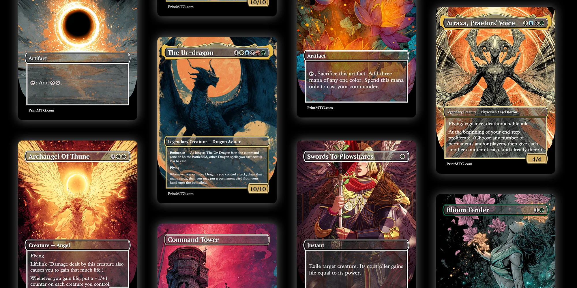
That’s where the PrintMTG Card Maker comes in.
Design your own Magic: The Gathering cards with the PrintMTG Card Maker
Most custom-card projects die in the same place: formatting. The idea is cool, but you spend an hour fighting text boxes and suddenly you hate your own commander. PrintMTG’s Card Maker is built to skip that part.
Here’s the practical workflow that keeps you moving.
- Start with an existing card (the lazy-smart move)
Search a real MTG card first. Let the tool auto-fill the basics like name, mana cost, type line, rules text, artist credit, and art. Then you edit what you actually care about.
This is perfect for alt-art reskins, custom commanders “based on” existing cards, or playtest versions where you tweak one line of text.
- Pick a template that matches your vibe
PrintMTG’s Card Maker includes multiple template styles (Modern, Vintage, Box Topper, Mystical Archives, Full Art). Pick one and stick to it for a batch. Consistency is what makes a pile of customs feel like a “set” instead of a folder of random images. - Edit the card like you’re editing a decklist
You get dedicated fields for the stuff that matters:
- Card name
- Mana cost
- Type line
- Rules text (and flavor if you want it)
- Power/toughness or loyalty
- Artist credit and that tiny bottom legal text
Because the layout updates live, you don’t have to guess where line breaks will land. It’s more like typing in a form than doing graphic design.
- Insert mana symbols without fighting fonts
This sounds minor until you’ve tried the “install a mana font and pray” method. PrintMTG’s editor lets you click to insert common symbols (including tap). Clean symbols, consistent spacing, no weird tofu squares. - Drop in your art and crop it like a normal person
Upload art, drag to reposition, scroll to zoom, and use the X/Y/W/H fields when you want it precise. This is the difference between “nice custom” and “why is the character’s face missing?” - Use the live preview as your sanity check
Do the arm’s-length test: can you read it from across the table? If the answer is no, trim text or pick a template with more breathing room.
When it looks right, you can save, share, or move toward printing. No exporting hoops required.
The card anatomy you actually need to get right
If you’re new to this, it helps to treat an MTG card like a little machine with labels. You can get wild with the idea, but the parts still need to make sense.
Here’s the checklist i use when i’m sketching a custom:
- Mana cost: sets expectations for power level. Cheap cards need tighter limitations.
- Color identity: determines what the card is “allowed” to do mechanically.
- Type line: Creature, Instant, Artifact, Enchantment, Planeswalker, Land. This affects rules interactions and deckbuilding.
- Rules text: keep it short when possible. Use existing MTG phrasing when it fits.
- Power/toughness (or loyalty): this is where a lot of customs quietly break. Numbers matter more than people want to admit.
- Rarity (optional, but useful): especially if you’re making a mini set or cube module.
- Flavor text (optional): the most fun part and the easiest to overdo. One good line beats three okay ones.
- Artist credit: if you didn’t make the art, credit the artist. It’s just good manners.
If you get these pieces right, your card will “read” correctly even if the design is spicy.
The color pie: your best friend and your strictest editor
If you want your customs to feel like real Magic, the color pie is non-negotiable.
A quick way to self-check is to ask: If this card were printed, would it feel normal in this color? Not “could i justify it in lore,” but “does this color do this kind of thing in actual Magic?”
A few simple anchors:
- White: balance, protection, removal with conditions, board wipes, rules-setting
- Blue: card draw, counterspells, tempo, copying, manipulating spells and libraries
- Black: discard, sacrifice, reanimation, paying life for power, creature removal
- Red: direct damage, impulsive draw, speed, temporary mana, chaos
- Green: ramp, big creatures, buffs, fight effects, artifact/enchantment hate
When you break the color pie, it stops feeling like Magic and starts feeling like a different game with MTG frames. Which is fine if that’s what you want, but most people designing customs want the “this could be real” feeling.
Balance that doesn’t ruin game nights
Custom cards rarely fail because the idea is bad. They fail because the play pattern is miserable.
Here are the tests that catch most problems early:
Compare it to real cards that already exist.
Find 2 to 3 close comparisons. If your card is better in every way, something’s off. If it’s worse in every way, it’ll never get played.
Watch for repeated value with no cost.
The classic danger zone is “draw a card” stapled to something that already advances the board. Free cards add up fast.
Keep triggers readable and trackable.
If your card needs a sticky note to remember all the conditional triggers, it’s probably doing too much.
Make the downside real, not fake.
“Discard a card” or “lose 1 life” isn’t always a meaningful cost, especially in the colors that like doing that anyway.
Respect the table.
In multiplayer Commander, a custom card that locks people out or drags turns into a 20-minute math problem is going to get side-eyed. You can still make powerful stuff, just aim for powerful and fun.
And yes, sometimes you’ll make an overpowered disaster. That’s part of the hobby. Fix it, version it, move on.
If you’re making more than one card, build a tiny “set skeleton”
If you’re building a custom set, cube module, or even a 20-card “theme pack,” you need structure. Otherwise you end up with 20 rares and no glue.
A simple skeleton looks like this:
- A few build-around signposts (cards that tell you what the theme is)
- Enough commons/uncommons to support those themes
- A couple of removal spells in each color
- A mana curve that isn’t all 4-drops
- Some fixing if you want multicolor decks to function
Even if you’re not doing Limited, a skeleton keeps you honest. It forces you to design the boring support cards that make the cool cards playable.
Art and layout tips that actually matter when printing
You don’t need to be a print tech, but you do need to avoid the three most common faceplants:
Use higher-res art than you think you need.
Small images look fine on a phone and fall apart when printed. Start with the best source you can.
Avoid busy art behind tiny text.
If your rules text sits on top of visual noise, the card will look cool and play terribly. The live preview helps you catch this fast.
Pick templates based on readability, not just vibes.
Full Art looks amazing, but it’s not always great for a “novel” of rules text. Modern or Vintage templates are often easier to read across the table.
This is one reason the PrintMTG Card Maker workflow is nice: you see the final layout while you work, and you can switch templates if the design needs more space.
Feedback and playtesting: the part that makes your cards good
You can do this casually and still learn a lot.
- Print and sleeve test: print on paper, cut it out, and sleeve it in front of a basic land. If it plays well here, it’ll play well later.
- Digital testing: some groups test customs online using tools like Cockatrice or Untap.in (it’s not always smooth, but it works if your group is committed).
- Community feedback: r/CustomMagic is big and blunt. That’s not always fun, but it’s effective.
The biggest tip: test one change at a time. Don’t rewrite the whole card every revision or you’ll never know what fixed the problem.
Other custom card tools (and why PrintMTG is still my default)
You’ll see a bunch of tools recommended in custom card circles. They all have their place.
Here’s the quick comparison:
| Tool | Best for | Why people use it |
|---|---|---|
| PrintMTG Card Maker | Print-ready customs, clean templates, fast workflow | Live preview, templates, symbol insertion, easy art positioning |
| Card Conjurer | High-fidelity frames and template tinkering | Lots of frame options and customization |
| MTG.Design | Quick mockups on any device | Simple, mobile-friendly browser builder |
| Magic Set Editor (MSE) | Managing larger sets on desktop | Batch workflow and set organization |
| Artificer | Designing on your phone | Mobile app experience |
If you want to make one custom commander tonight, you can use almost any of these.
If you want a workflow that feels like editing a decklist and ends with a print-ready result, PrintMTG’s Card Maker is the smoothest path.
Also, yes, AI art is a thing in 2026. If you’re using it, the main practical advice is boring: export high resolution, keep the focal point clear, and don’t let the background fight your rules text.
Conclusion
If you want to design your own Magic: The Gathering cards, don’t start by trying to invent a whole set and a new keyword system on day one. Start smaller.
Make one custom card that reads cleanly, plays well, and looks good in sleeves. Use the PrintMTG Card Maker to handle templating and layout. Then iterate like a real designer: one change, one test, one version at a time.
And when you finally resolve your custom commander and the table immediately groans, congrats. You made something that feels like Magic.